Quick Tips to Editing Your Photos Like a Pro
It is difficult to overestimate the power of a photo. Capturing some of your best memories with family and friends, a photo instantly transports you back to the moment, and also helps you to share these experiences with others who weren’t there. Our photos from our travels have become our most cherished possession. They continue to make us so happy as we look back through them time and time again.
That being said, the photo editing process can feel overwhelming at first! It seems like there are endless buttons and dials with so many different ways to achieve similar effects. We want to share with you a few simple adjustments that will help you to create balanced and eye-catching images. In this post will cover the difference between mobile and desktop editing, presets, white balance, basic editing tools, color adjustments, specialty effects, and cropping.
We wish we knew these easy tips when we started, because they have really helped us to speed up and refine our editing style. And remember, photo editing is like any other form of art, there is no “right” or “wrong” way, there is only preference and style.
Let’s get started!
1. Import to Mobile or Desktop
The first step to editing a photo is to decide if you want to edit on your phone or desktop computer. There are a lot of editing applications available for both mediums. Some of the more popular platforms are VSCO, Adobe Lightroom, and Pixieset. Each has its pros and cons, but after trying those as well as many others, our favorite is still Adobe Lightroom. We love that Adobe has a desktop and mobile version (the mobile version is free through the Lightroom CC app) so you can seamlessly transition between the two, providing the most flexibility in editing. Adobe Lightroom also offers the widest array of adjustment tools including things like in-depth color controls and masking brushes for spot editing. We found that once we started using Adobe Lightroom, our photo edits dramatically improved.
Since Lightroom has two different interfaces (Desktop and Mobile) it can be hard to decide which one to use for editing. For us, it really depends on the camera used, how much we want to edit, and how much time we have. Maybe our thoughts can help you decide what fits best for you:
Desktop/Laptop: Most of the time we import camera, drone, and GoPro images directly to the desktop and edit from there (that way we don’t use too much phone storage). We like to import all our photos together and keep them in one central place, to make sure we don’t miss or delete any by accident. We also love editing on desktop because it is easier to make a lot of changes or do more in-depth adjustments like masking brushes, spot adjustments and replacing images. The mobile app does have these same settings, but can be tricky without a stylist.
Mobile: We use mobile apps to edit all our smartphone photos for on-the-go editing and making quick adjustments. It is nice to have a powerful editing program like Lightroom to edit on the phone. It means we can edit literally anywhere from airplanes and trains to boats and buses, or even in bed. And it’s perfect for social media posting because the final edit will already be on the phone! A lot of cameras, drones and action cameras have the option of transferring straight to your mobile device through wifi or bluetooth (this can sap the battery though). Usually if we do this it will just be our favorite photos and we will be sure to not delete them, so we can still import the photos later all together to desktop.
2. Apply Preset
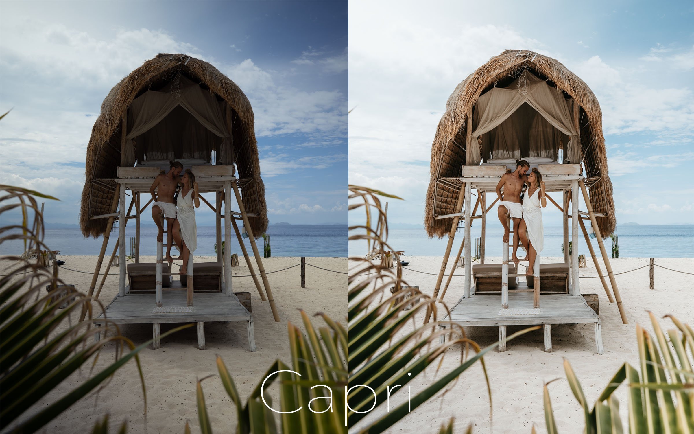
The best way to easily cut down on editing time and maintain a consistent theme/color profile to your images is to use photo presets. We use presets on all of our photos because they usually will get us somewhere between 80%-100% of the way to a perfect edit, ready for Instagram or a client. So what is a preset? Essentially a preset (PREvious + SETting = “Preset”) is a saved setting of all the adjustments made to color and lighting profiles. This setting then can be applied to any photo of your choice.
Presets help create consistency. You’ll notice most of our collections will have 16-17 presets in them, because we know that not all photos fit into one preset look. Though they are different, they combine together to create a specific overall look. We try to focus in on 2-3 colors per filter so it is not too overwhelming to the eye. Different photo situations tend to emphasize different color palettes, for example when we are shooting city shots or indoors you will find more moody tones of browns and creams versus in tropical or beach settings will be more brighter colors of turquoise, greens and oranges.
Think about the colors/vibe you want to accentuate in your photos. A great place to start can be creating a mood board on Pinterest. If you are shooting a specific product, vibe, or location, notice the colors other photographers utilized in their work for the same subject, then create your own idea of how you want to approach it. Try sticking to a specific editing style for at least a few weeks to see how to feels and looks. Shifting styles too quickly can result in confusing and disjointed portfolios and Instagram feeds.
Pro Tip: To create or customize your own preset, simply make all the adjustments you like to a photo, then while in the Developer tab, find the section for Presets. This will either be on the far left (Lightroom Classic) or down at the bottom of your Developer tab on the right (Lightroom CC). Click the “+” symbol (Lightroom Classic) or “•••” symbol (Lightroom CC) and then select ‘Create Preset’. You can then choose from the window the settings you want to save. Generally I will choose all of the tabs except Exposure (lighting can be very different photo to photo), Lens Corrections, and Transform Corrections. You can then give it a name you will remember and use it again and again!
3. White Balance
After applying a preset, the first thing to do is adjust the white balance. This comprises of the temperature and tint sliders. White balance can dramatically shift the color profiles of a photo depending on what the lighting was like when you took the photo. Here are a few basics ideas to help you find the right white balance:
Adjusting to the whites of a photo: Find something white in a photo, maybe it’s clothing, clouds, or a wall that you know was pure white. Then use the eye dropper to click on this area and it will automatically adjust entire photo in reference to this “true” white. This either works amazing or not at all. Try it out to see if it can save you some time but usually we find adjusting manually gets us to a better place.
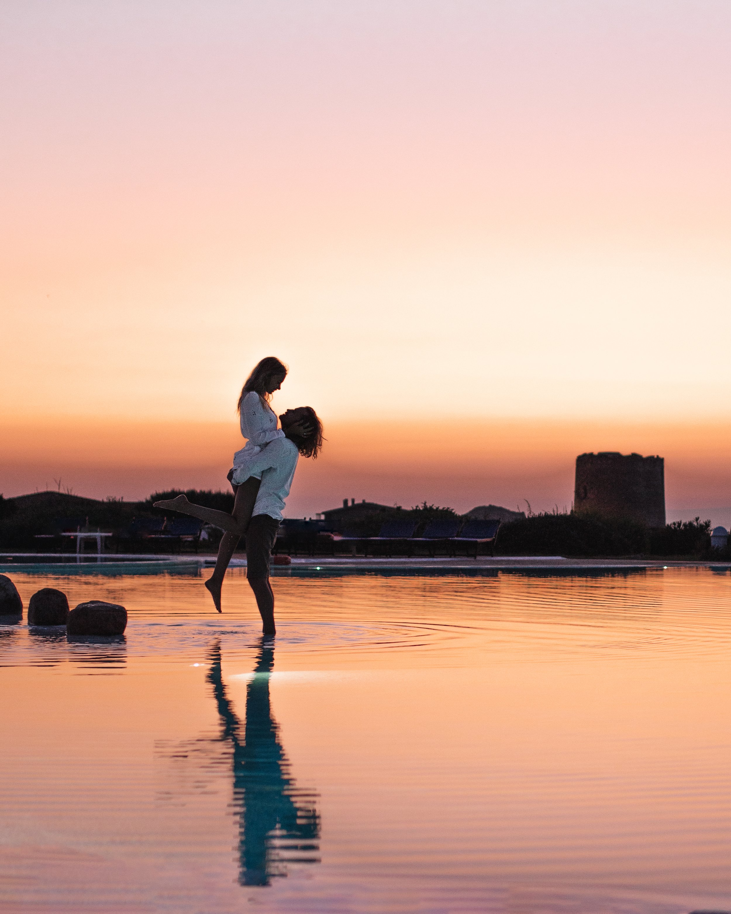
Sunsets: When adjusting sunsets, play with a warmer temperature and more red tint. This can really help make those sunsets pop.
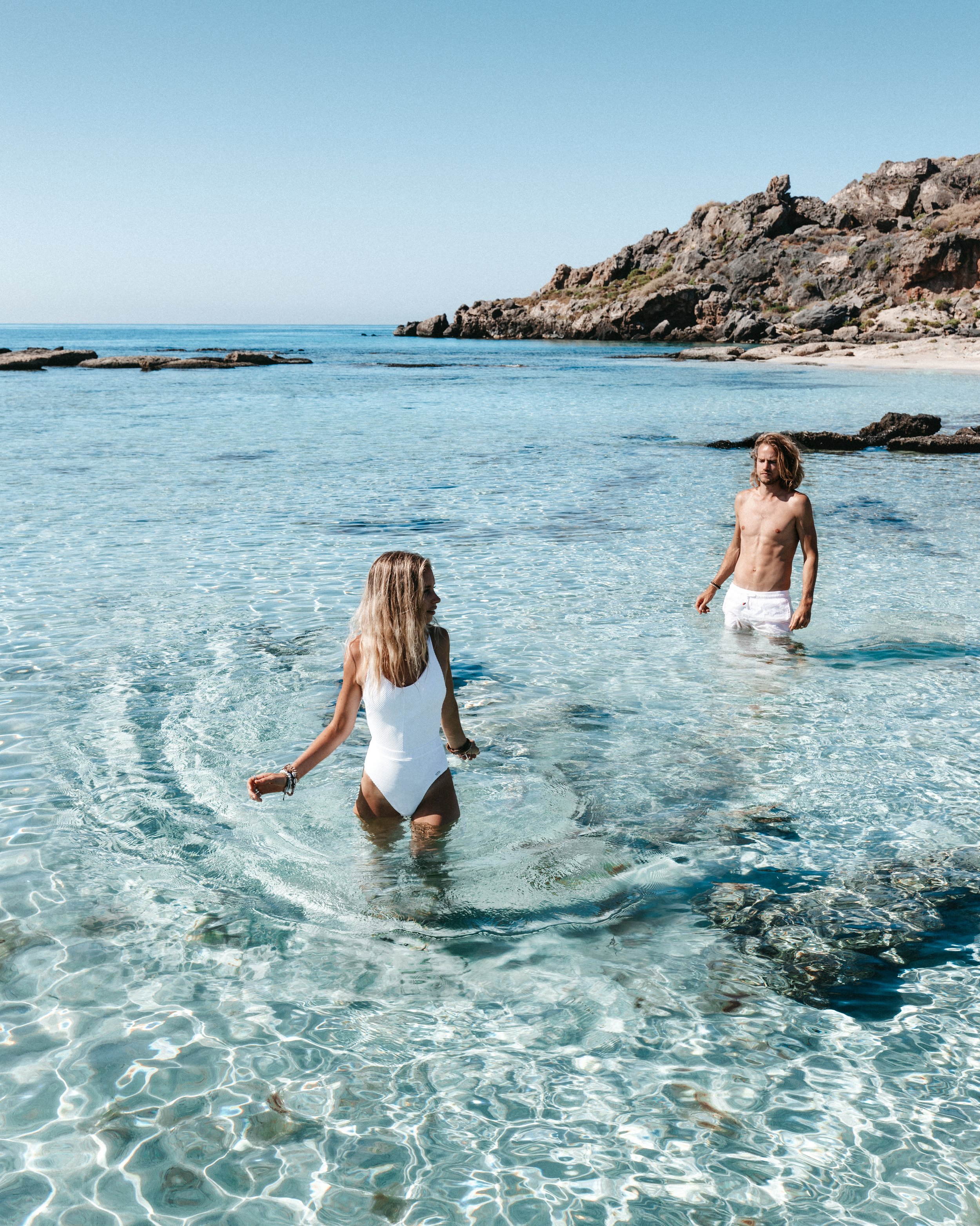
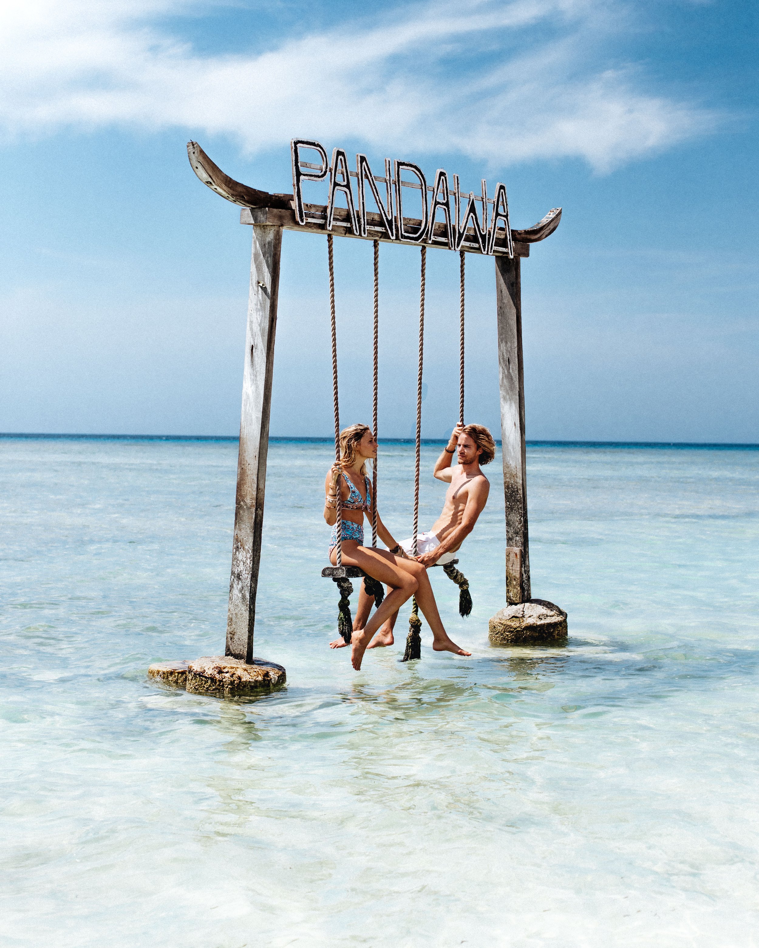
Ocean/Beach: We generally like to lean toward the cooler side to really bring out the blues in the water. Just be careful not to go too far and get overly saturated blues. Also be conscious that skin tones don’t become too under saturated.
Indoors: This is where you will need to really focus on what kind of lighting you are working with. With warmer lighting (yellow/orange) you will want to cool the white balance until it feels more neutral. With cooler lighting (white/blue) you may want to warm up the white balance to compensate
Skin Tones: If the skin tone seems off, you will want to begin your adjustments in the white balance (not the color panels). This will get you closer to where you want to be on a larger scale and allow for much smaller tweaks/adjustments later. Anytime you are adjusting white balance, really watch how the skin tones change.
4. Basic Edits
Next up is to adjust the basic editing panel. The first slider and most important is exposure. We adjust exposure to either lighten up a photo with too many shadows or darken a photo that is too bright. From there, you can make small tweaks to things like blacks, shadows, whites, and highlights. Depending on the photo, you might try different balances. Here are a couple tricks to tackle common issues:
Shadows/Contrast Too High: Try increasing the shadows first, then decrease highlights, and finally increase blacks. You want to be careful in lifting the blacks too much because it can create a very matte/flat looking image (which you may or may not want).
Recover A Blown Out Sky: This may or may not be possible depending on how the image was shot. If you underexposed the photo in camera, and just lost the detail after raising your exposure slider, you are in luck because you can recover that detail by decreasing the highlight slider. If you overexposed the photo in camera and didn’t capture enough detail, sadly there is nothing you can do to recover except to try shooting again more underexposed.
Pop the Whites/Brighten Up a Photo: Try increasing your white and highlight of a photo. Be sure to balance this with the shadows and blacks to make sure you don’t lose the contrast of the photo or have it coming out looking more “dusty.”
5. Color Adjustments
The color adjustments are where we will spend most of our time editing. This is where you can really take photos to the next level by emphasizing specific colors. Lightroom gives you a lot of control over colors with adjustments in hue, saturation and luminance. If you really want to get fancy you can even adjust the split tones which controls the color of the highlights and shadows of your overall image. Because there are so many options to choose from, the color adjustments can become overwhelming and time consuming. That is why we love using presets because they provide a good color base. After applying a preset, here are some small adjustments you can make to enhance the photo:
Perfecting Skin Tones: For us, skin tones are controlled mainly by the oranges for the base, yellows for the highlights, and reds for the shadows (this may change depending on your skin). Usually if we are trying to get that tanned sun kissed feel we will decrease both the luminance and saturation on the oranges. You can then play with adjusting the yellows and reds to get the highlight effect you want. If it is an indoor shot or heavy shadows you may want to try increasing the luminance of all three to make sure you stand out in the photo.
Blue Water: Water is mainly effected by the blue, aqua, and green. Depending on the color of the water, it may be effected differently by each of those 3 sliders. You can play with the luminance and saturation of each to get water looking the way you like. For example if you want water that looks deeper blue try decreasing luminance of blues, for more shimmer try increasing luminance (especially of the aqua and green), or for more pop in color try increasing the saturation of blues and turquoise. If you find your water is overly green, try adjusting the hues of the green all the way over to the right to be more turquoise.
Sunsets & Sunrises: Sunsets will likely be controlled by your oranges, pinks, purples, reds and yellows. Depending on how the colors looked that night, different colors will be more prominent. Try playing around with the saturation and luminance of these colors until you find one that looks nice. Be careful to watch skin tones though when playing with the orange, reds, and yellows to not throw them off too much. If you really want to make your sunset dramatic, you can try playing with the split tones to exaggerate the colors.
6. Specialty Effects
The next step is to look at details like grain, vignetting, softer/sharper contrast, or eliminating items from the photo. These are little tweaks that can be done to really boost the feeling of the photo to make it more vintage, cinematic, or dreamy.
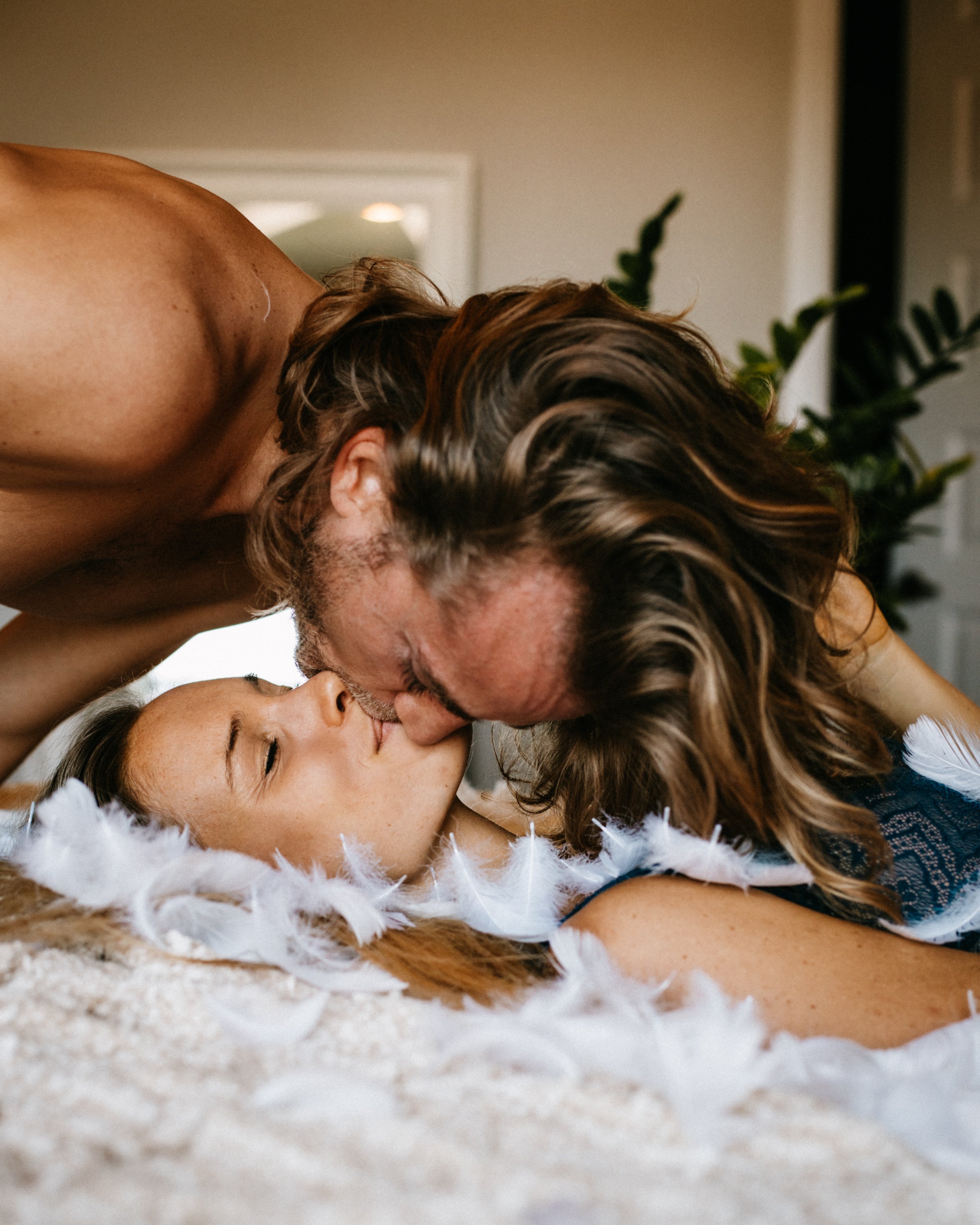
Grain: Adding grain to a photo can make it feel more vintage or moody. Usually I will do this to up-close cozy shots, or when I want to add a really bohemian vibe to the photo. You might notice this effect in some fashion or wedding type photography. You can add this effect by going to the details panel at the bottom and adjusting the grain slider. A good place to start is first with just the amount slider. If you want to get more technical/detailed you can also play with the size and roughness of the grain.
Vignetting: Adding a nice vignette (darkening around the sides) can be great for a moodier more cinematic look. We love to do this especially for portraits, sunsets, and darker shots. There are two things to keep in mind for vignetting. First be sure to not have the lens correction box ticked in Lightroom, this will take away any vignetting caused by the lens of the camera. Second, if you want to increase the vignette, navigate to the effects panel and ‘post-crop vignetting’. Here you can adjust the amount (intensity), midpoint (how much of the edges are effected), roundness (make it more round or square), feather (how sharp the edge is), and highlight (if you allow any of the highlights/whites to show through the vignetting).
Softer Photo: To achieve that soft dream-like quality to a photo there are a couple of key adjustments you can do. This can be great for shots with a lot of sharp shadows, smoothing out skin in portraits, smartphone photos or night shots with too much grain. You have a few different options for this effect. Start first by playing with decreasing clarity, contrast or texture in the basics panel. To get an even softer look, go to the effects panel and try tweaking the sharpness, masking and noise reduction.
High Contrast Photo: Higher contrast photos can be great for creating a cinematic and very professional look to your photos. This is especially nice for dramatic landscapes, moody portraits, and photos shot at golden hour. You can do this by adjusting the contrast or clarity in your photo . These small adjustments will have similar effects but still slightly different, so play around with both.
Eliminating Objects: You can eliminate objects right in the Lightroom program using the spot healing brush. This can be done for small items like people or trash on the ground. If it is a larger more complex object though, typically I will do this in Photoshop because there are more options for more complex adjustments.
7. Crop to the right medium
The final step is always cropping to whatever platform we will be sharing the image to. For Instagram, we always crop to 4:5 aspect ratio. For our website we will either keep it horizontal or crop to that same 4:5 aspect ratio to keep consistency across platforms. You will want to consider the framing of the shot and rule of thirds (see more about it in our post about photo composition HERE).

We hope this was helpful! Let us know your feedback on this or if there is anything else you’d like to know more about in the comments below!